2023-2025
Father's Playbook App
UI/UX design, Visual identity design
Role: Lead Product Designer
Team members: 2 UX Researchers, 3 Software Engineers, 2 Visual Design Intern


The Father's Playbook is a collaborative mobile application developed across multiple University of Texas institutions, designed to provide essential prenatal guidance for expectant fathers. Building on extensive research conducted by the Center for Health Communication at UT Austin, I served as the lead product designer, working closely with the development team to create and launch the latest version of the application.
For this release, I led a complete visual identity redesign, ensuring the new design aligned with user needs and engagement patterns. Additionally, I translated research insights into an intuitive, engaging experience that effectively supports fathers throughout the prenatal journey.
Problem Statement
Research shows that when fathers are actively involved during pregnancy, maternal and infant health outcomes improve significantly. Despite this, most prenatal resources are designed primarily for expectant mothers. Fathers are often left with little guidance on how to support their partner or prepare for parenthood.
Father’s Playbook was designed to close this gap by providing practical, approachable guidance for expectant fathers during pregnancy and early parenthood.
Goals and Principles
To guide the design of the product and its content, we established three core principles.
- Make it actionable: Information should lead to doing. Each piece of content helps fathers take a concrete step, whether that means preparing for a prenatal visit or supporting their partner during pregnancy.
- Speak with respect, not authority: The tone is supportive and conversational. The app treats fathers as capable partners rather than passive observers.
- Reflect real dads: Many parenting resources rely on generic stock imagery and pastel aesthetics. We aimed for a visual language that felt relatable, modern, and engaging for fathers.
Brand Design and Visual Identity
Before designing the product interface, we developed a visual identity for Father’s Playbook. The goal was to create a brand that felt friendly, approachable, and distinctly different from traditional parenting resources.
Working closely with the research and health communication teams, we established guidelines for voice, typography, color, and illustration. The resulting identity emphasizes warmth, clarity, and relatability while remaining credible within a healthcare context.
This foundation ensured consistency across the mobile app, website, and outreach materials.
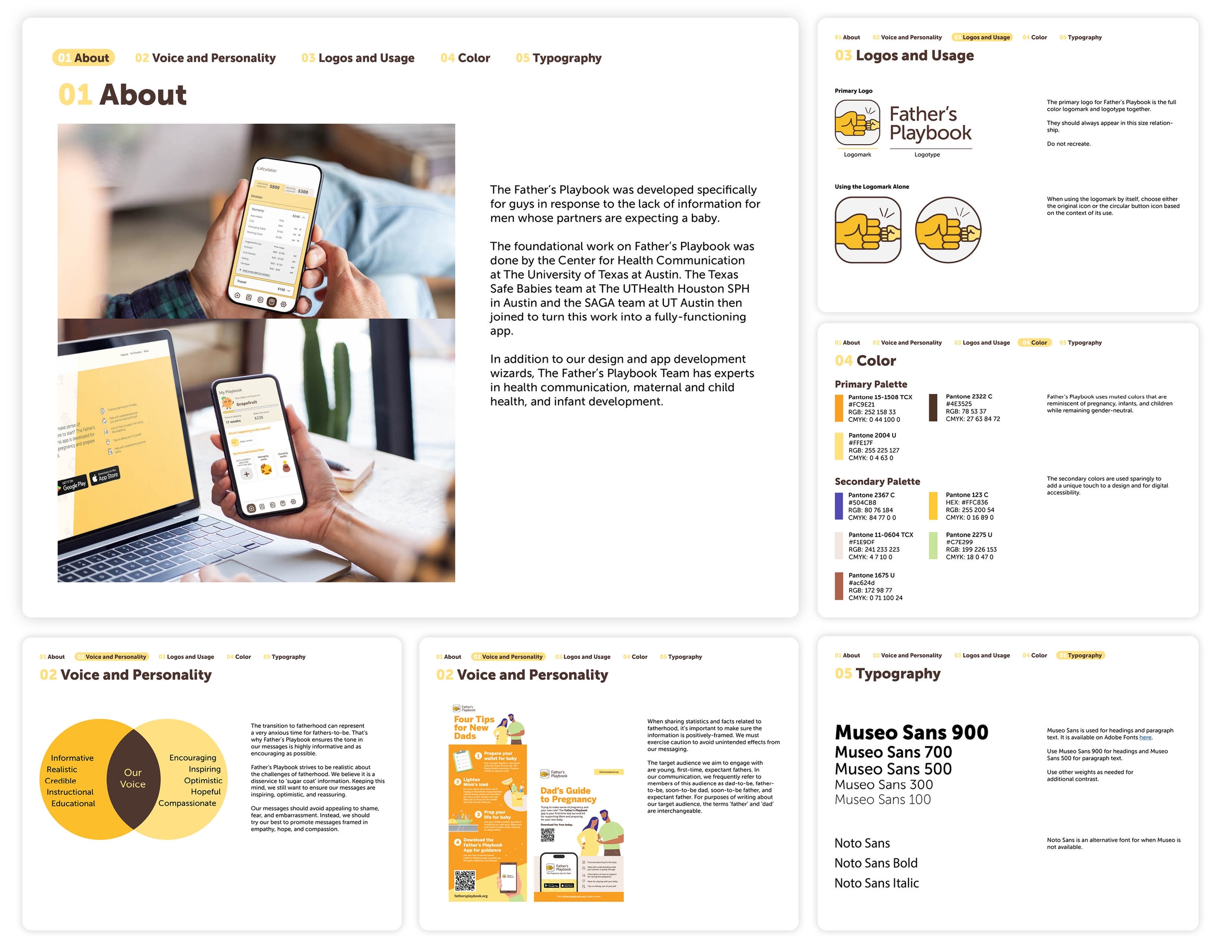
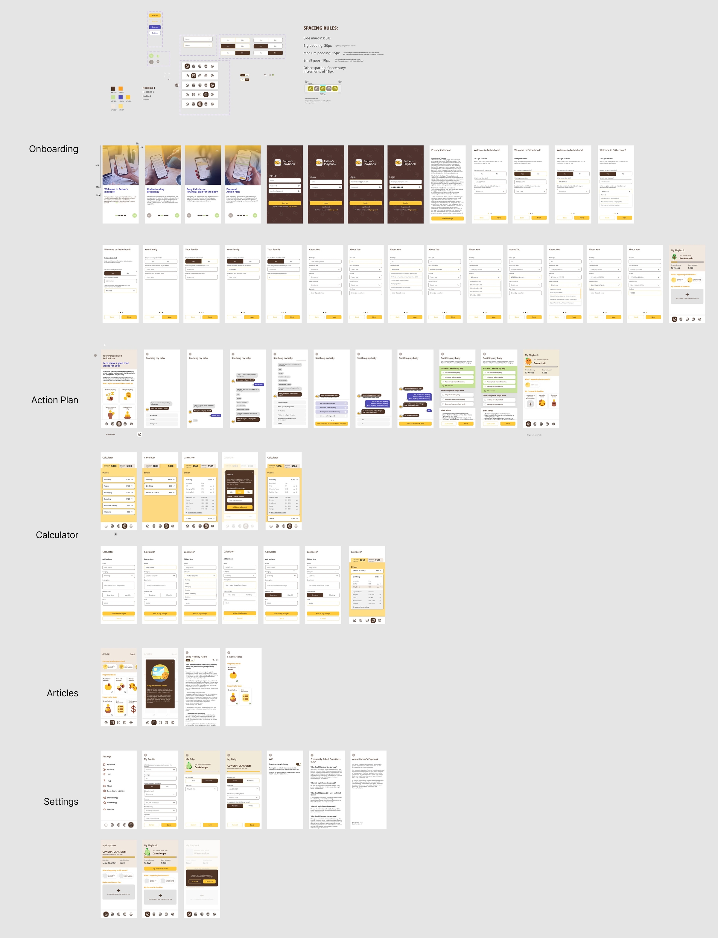
Brand guideline designed for the Father's Playbook mobile app.
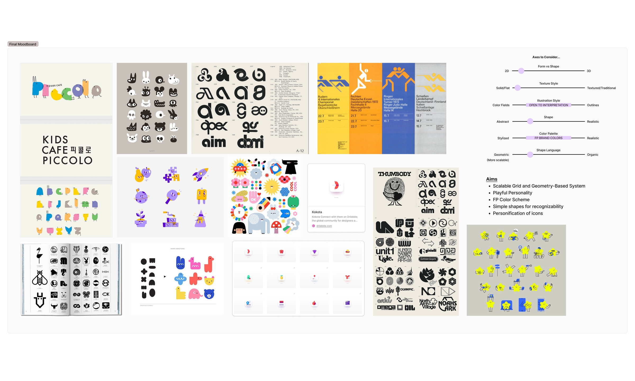
Left: vision board for the new visual identity of the app. Right: icon system and assets that were developed for the
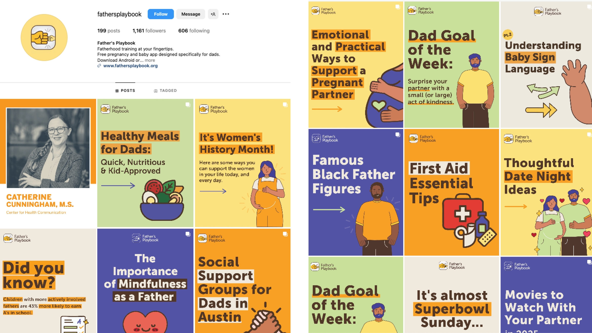
Some examples from marketing design campaign on social media following the brand guidelines
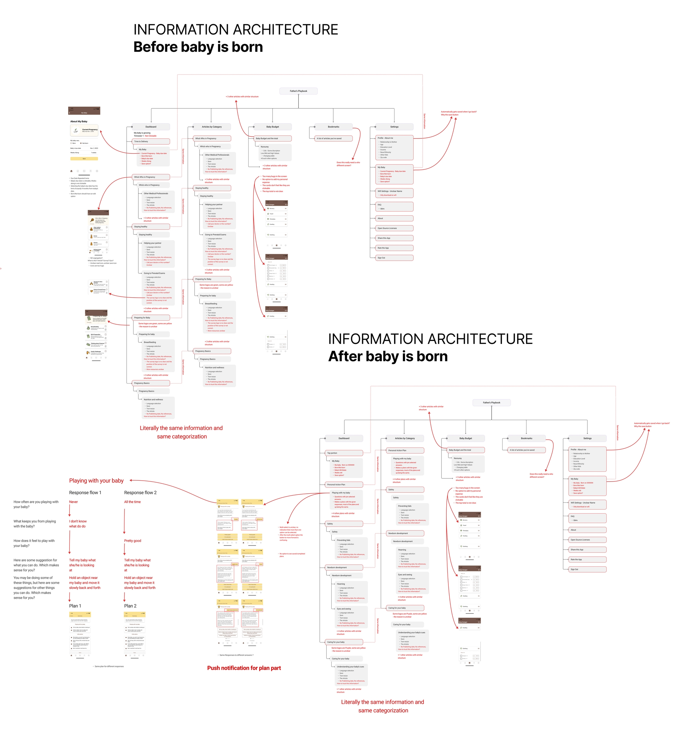
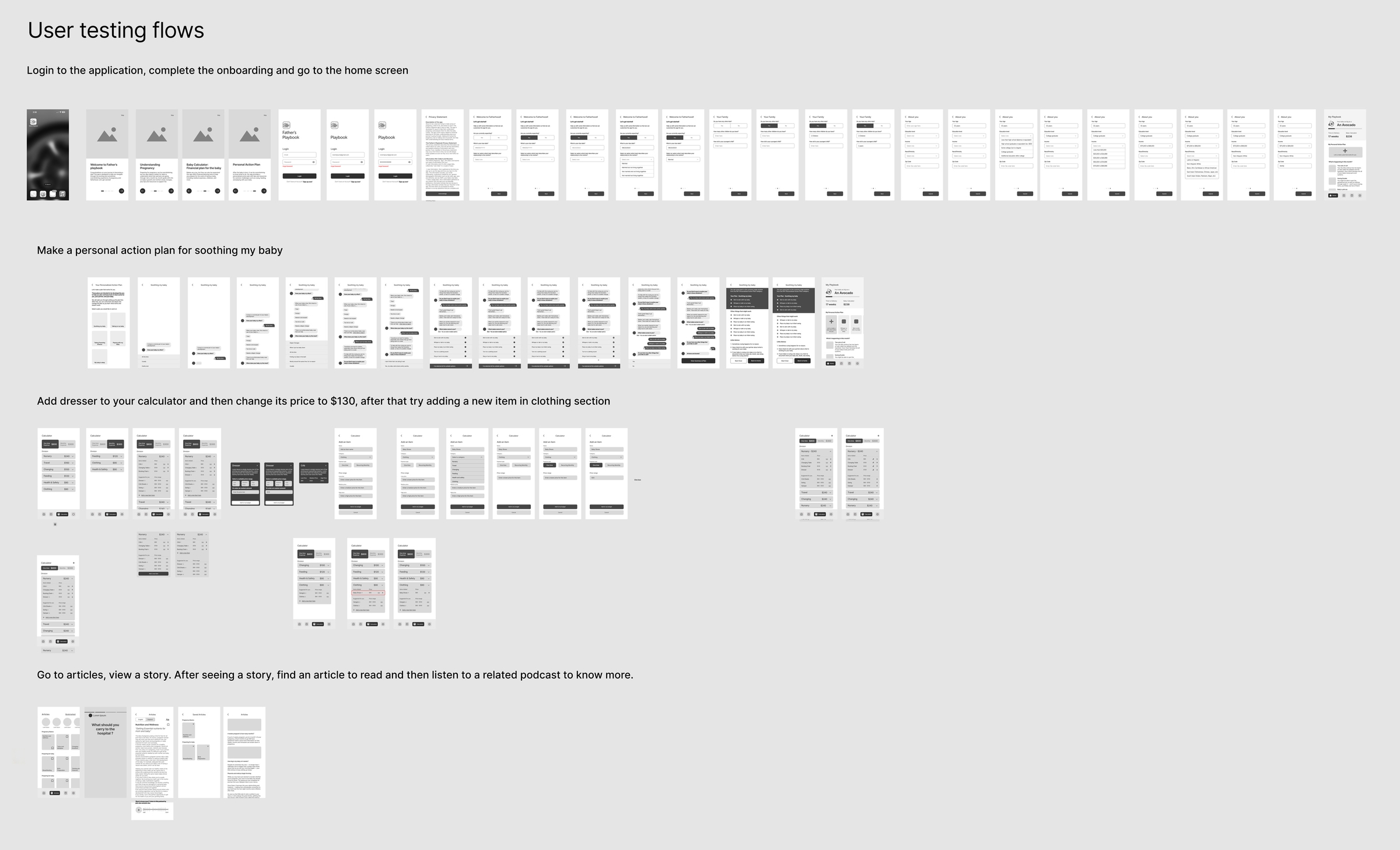
Information Architecture and Wireframes
After defining the core features, I developed the information architecture and low-fidelity wireframes to map the app’s structure and primary user flows.
The goal was to organize information around the real needs of expectant fathers while keeping the experience simple and easy to navigate. Wireframing helped clarify navigation, prioritize key resources, and define how features like articles, personal action plans, and baby development tracking would work together.
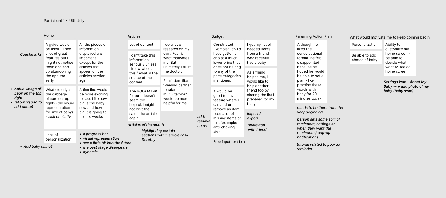
Notes from user testing interviews with our focus group
Prototype
I created a high-fidelity interactive prototype in Figma to simulate the core flows of the application and test the visual direction.
The prototype allowed the team to share a realistic version of the product with our focus group of fathers and caregivers. Feedback from these sessions helped identify usability issues, refine navigation, and improve the overall experience before development began.`
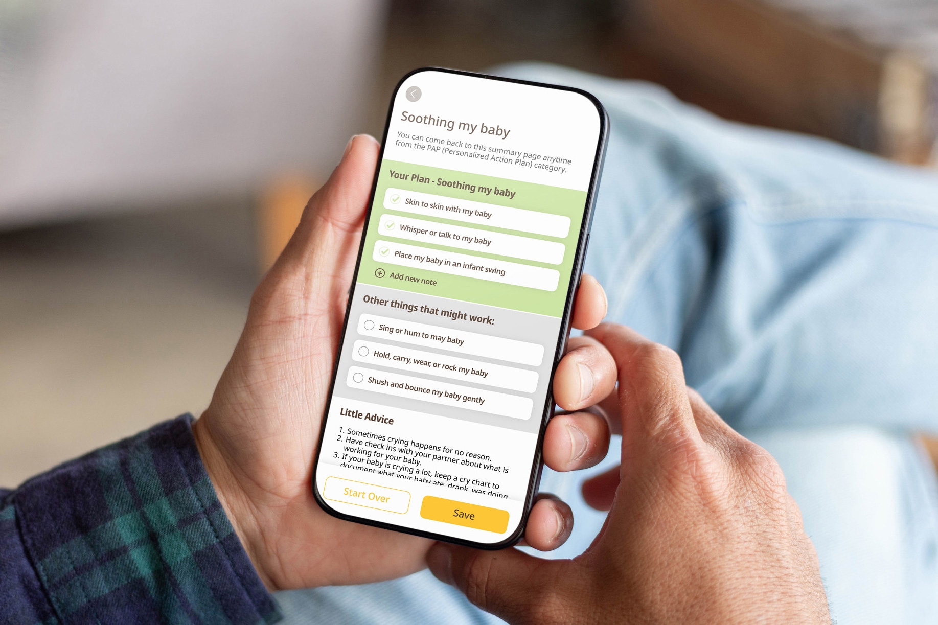
Key Product Decisions
Navigating pregnancy health can be overwhelming. We aimed to make complex information feel approachable and engaging, effectively turning data into delight. To achieve this, we focused on these key design ideas:
- Breaking down complex topics into short, digestible “snippets”
- Using a card-based layout inspired by social media to reduce friction
- Timing content to the baby’s developmental stage so information stays relevant
- Creating a sense of progression to encourage repeated engagement with the app
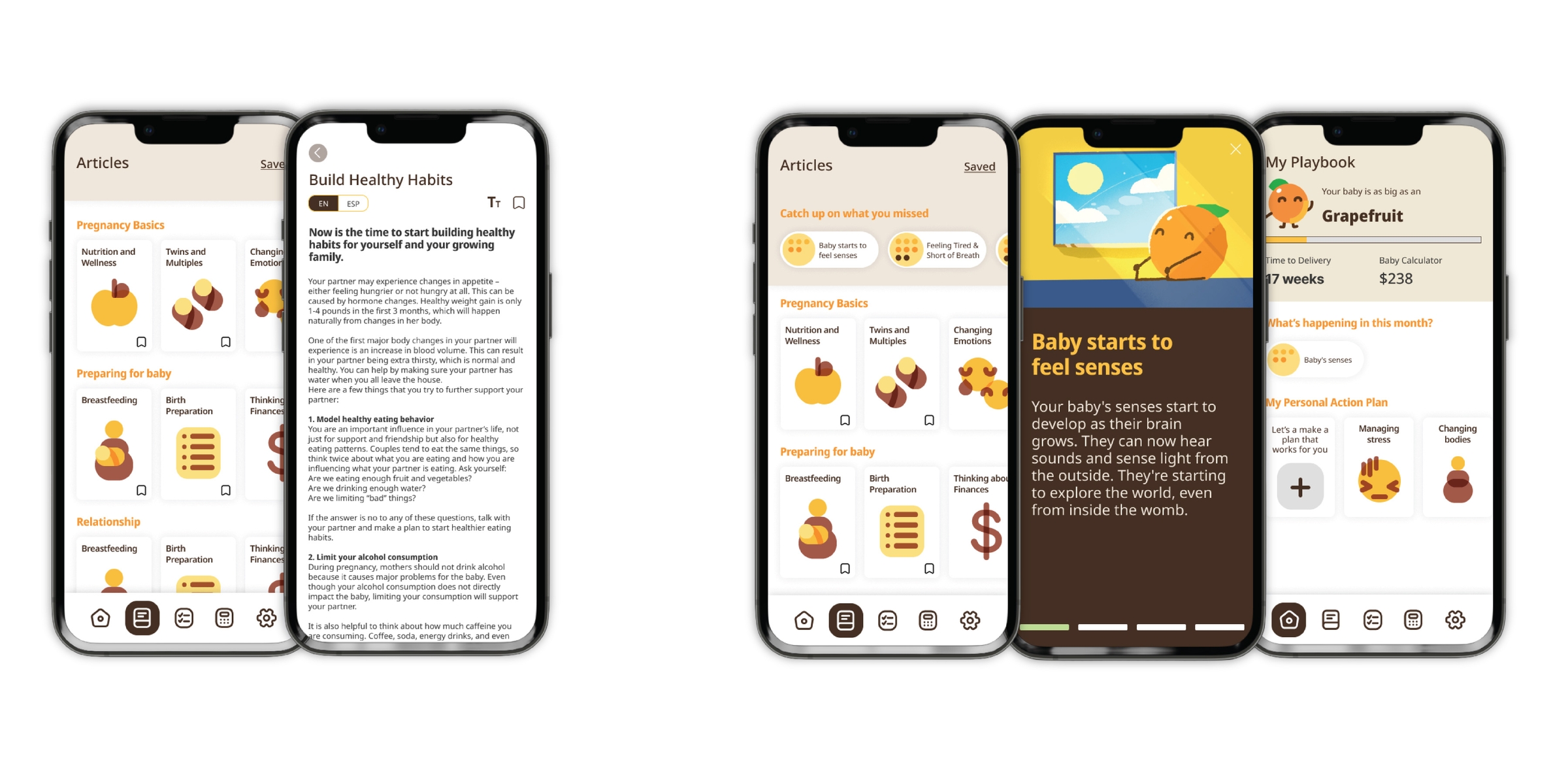
Flows designed for articles and snippet features
Results
The Father’s Playbook app launched publicly and quickly gained traction among expectant fathers and healthcare educators. Here are the stats as of December, 2025
- 45,000+ app downloads
- ~1,230 active daily users
- ~6000 monthly website visits