2019-2025 (4-6 months per project)
Interactive Data Visualizations
UI/UX design, Full-stack development, Mapbox, D3.JS
Role: UI/UX Engineer
Team members: Data Scientist, Project Manager, Product Owner, Comms Director,


UT System Population Health is committed to making the big health data accessible to other researchers, policy makers, and the general public by analyzing, interpreting, visualizing, and mapping the data. But the data wasn't reaching when I joined the group. Over the span of 4 years, I did stakeholder and user research, acquired the latest interactive data visualization skills and created 4 data dashboards, two of which have been awarded the best interactive data visualization in health by the American Association of Geographers (AAG) Health & Medical Group and have been featured in several publications.
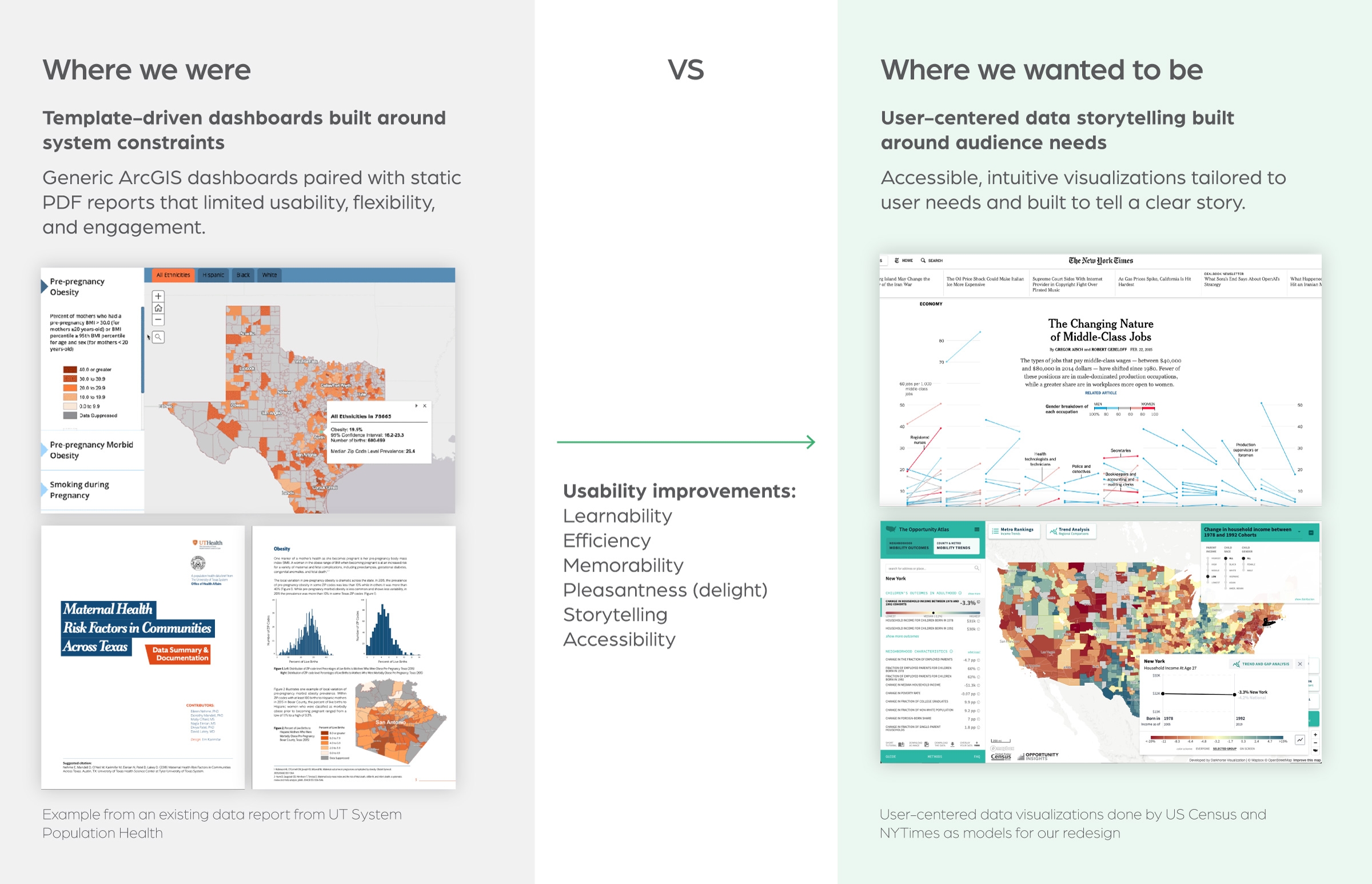
Problem framing
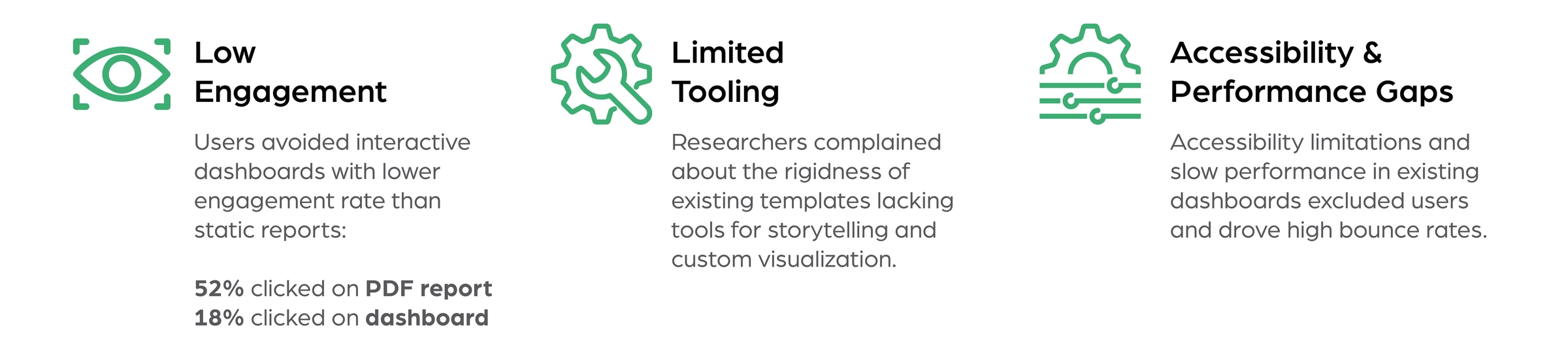
Analytics data showed consistently low engagement with existing dashboards, with users favoring static PDF reports instead. Stakeholder and user interviews uncovered two primary causes: researchers found current templates too rigid, lacking tools for storytelling and custom visualizations, while accessibility issues and slow performance created friction for end users and increased bounce rates.
Maltreatment Risk in Texas
Client: Texas Department of Family and Protective Services (DFPS)
Date: 2021–2022
Role: Product design & development
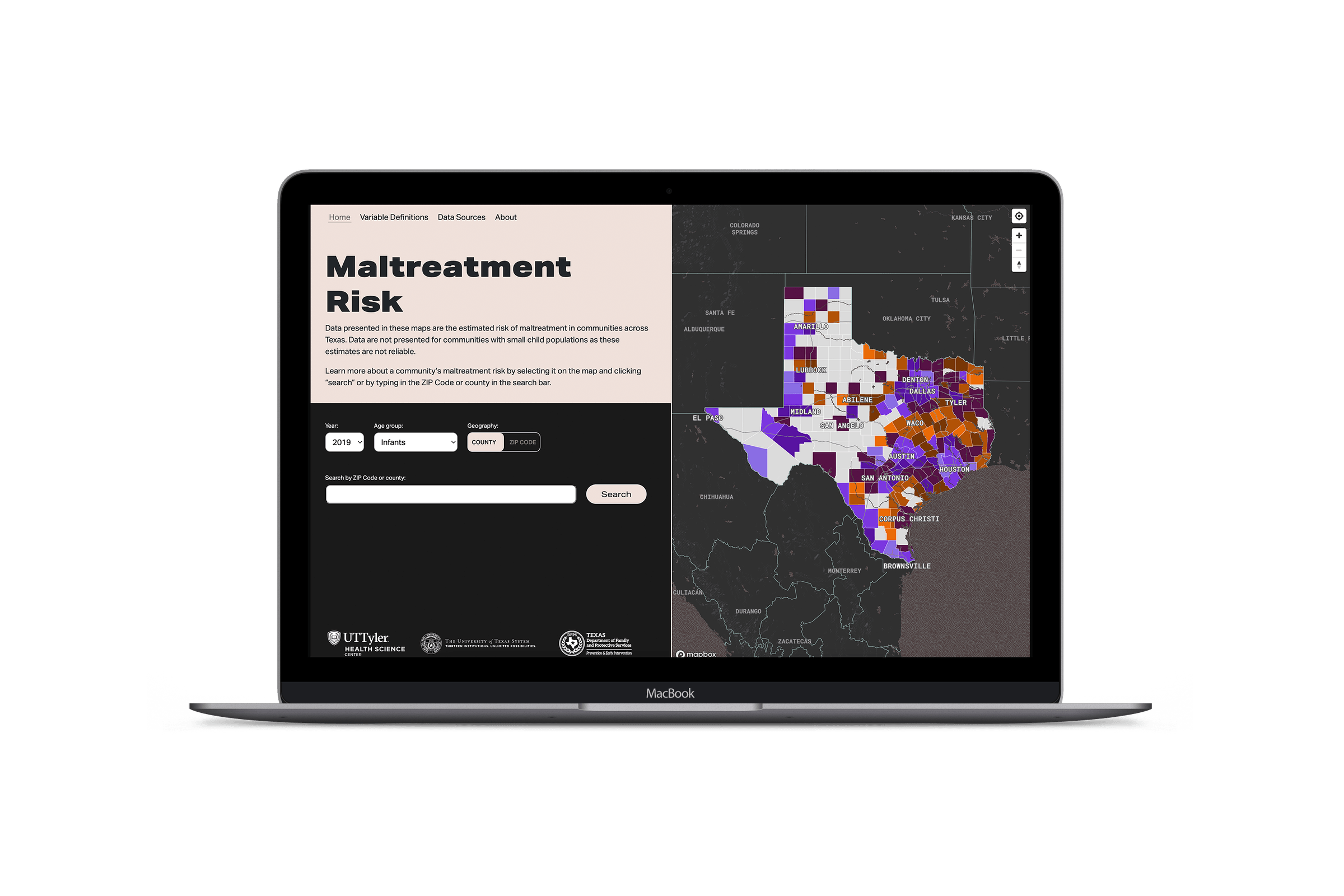
The Texas Department of Family and Protective Services partnered with UT System Population Health to develop community maltreatment risk maps for the state of Texas. The epidemiologists in our group developed ArcGIS maps to visualize very complex data at ZIP Code level for public use. Even though these maps could show great insights about the data and inform the policy makers and other researchers about the risk in communities, they were underutilized because they were hard to interact with by the users.
Stakeholder and user interview findings:
I started by doing a heuristic evaluation of the existing maps and interviewing the real users & stakeholders.

Wireframe & prototypes
After collecting user and stakeholder insights, I started conceptualizing the visualization and wireframing the dashboard. The biggest challenge was to visualize and present all variables (there are 41 variables for a county or ZIP Code) in a simple way that doesn’t overwhelming the users.
Multiple low-fidelity prototypes were designed and tested with users. I designed and tested multiple prototypes for the dashboard, iterations included:
- Progressively revealed data through guided interactions (modals, tabs, contextual panels)
- Showing different levels of data while interacting with map
- Different data visualization charts (line chart, donut chart, custom designed charts)
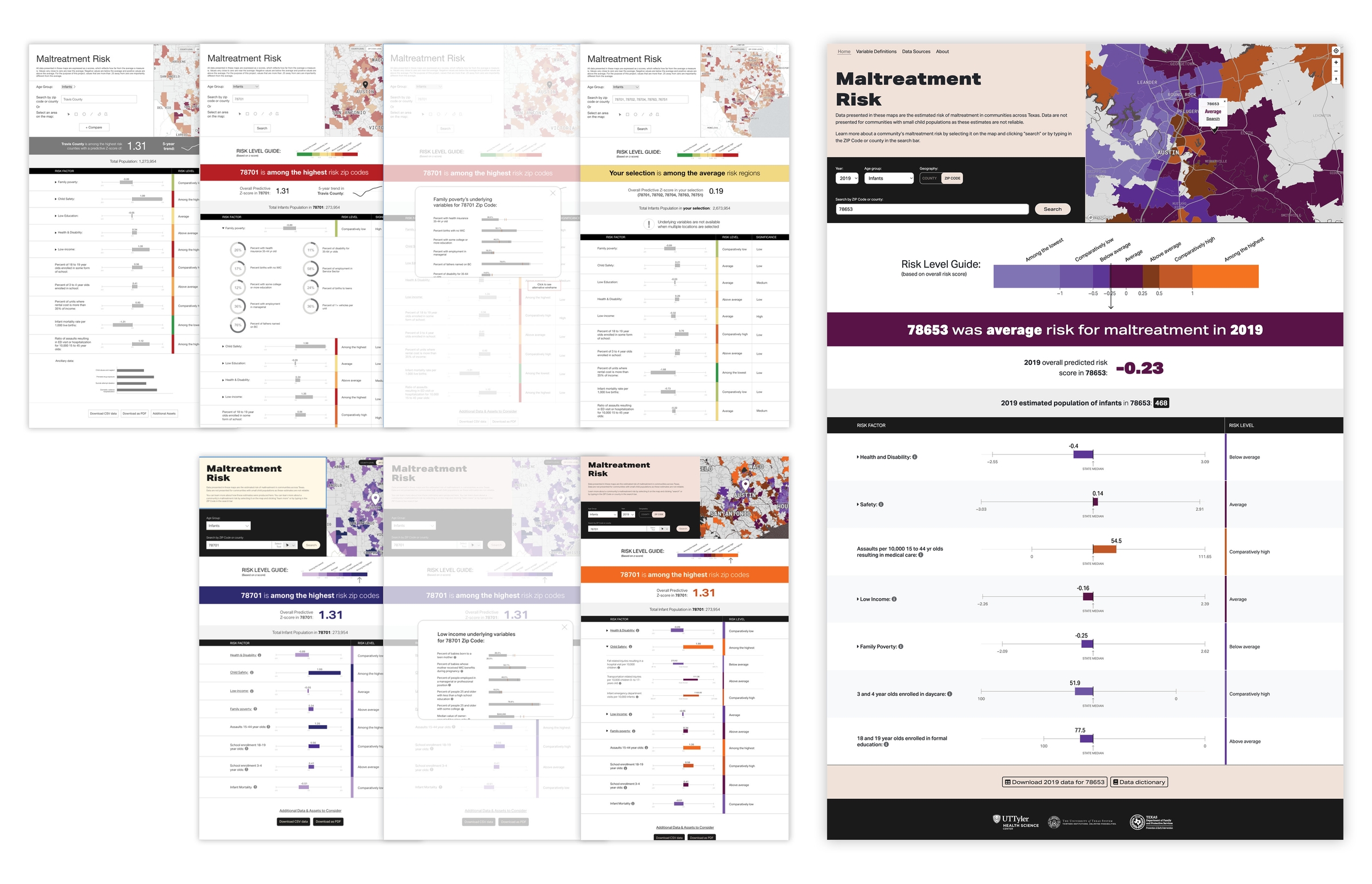
Some iterations of the wireframes and prototypes developed for user testing. The final prototype is shown the right.
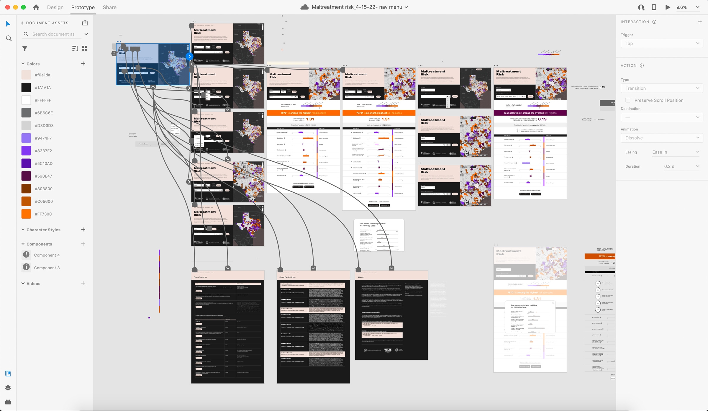
A screenshot showing the designer view of the final prototype developed for testing
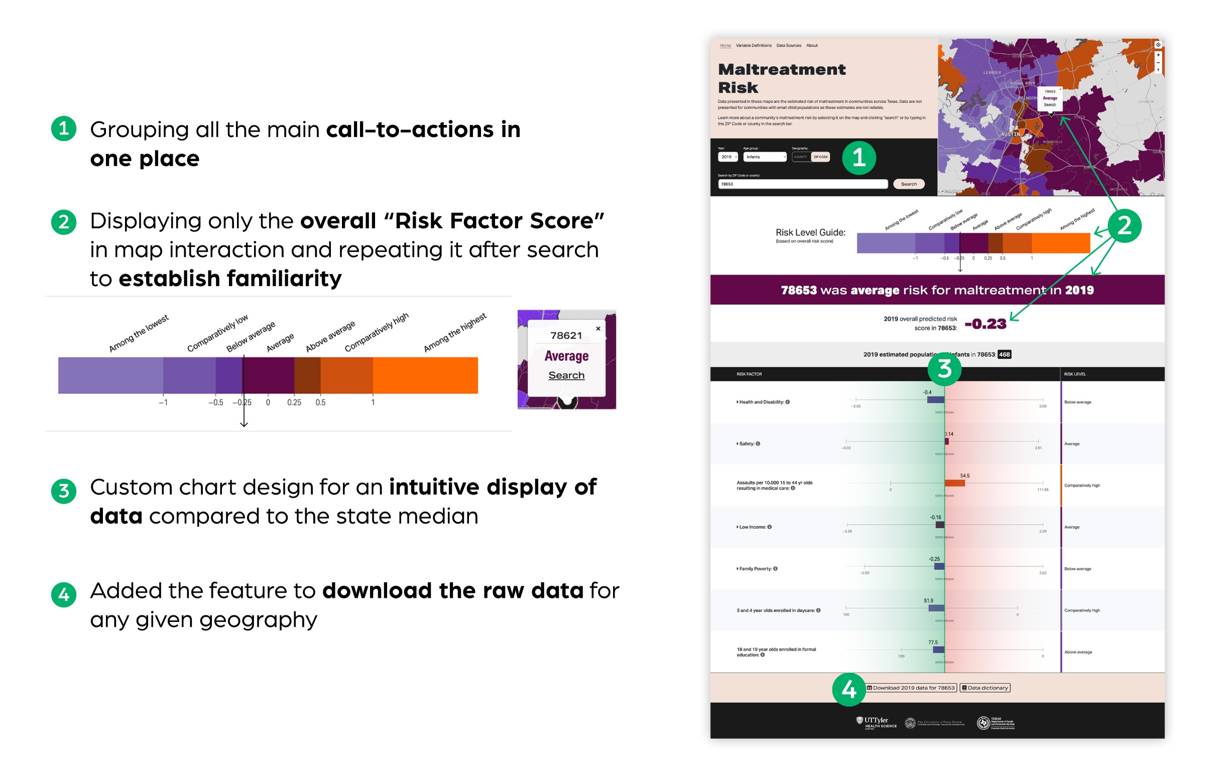
Main design decisions
Results
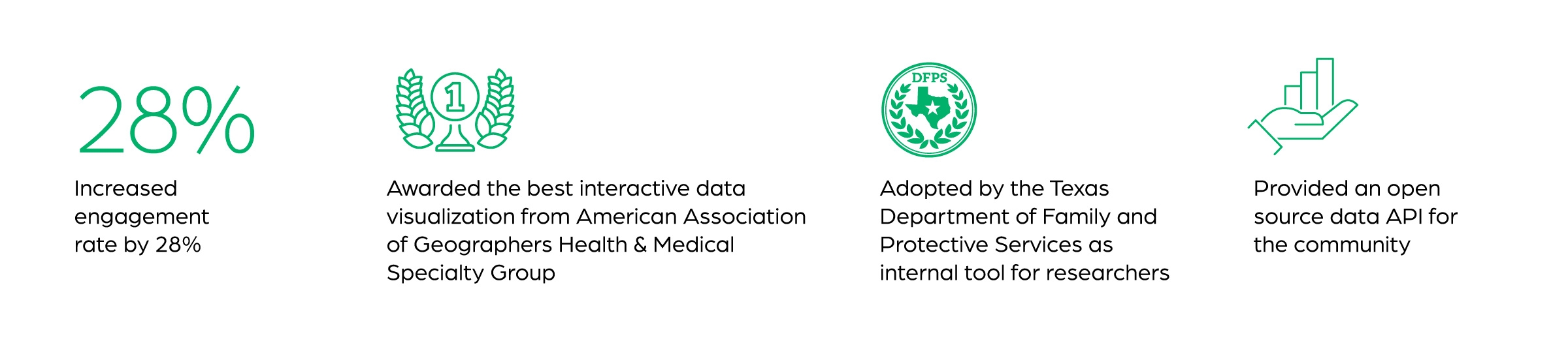
This data visualization was presented in the 2021 American Public Health Association (APHA) annual meeting and has been awarded the best interactive data visualization in health by the American Association of Geographers (AAG) Health & Medical Group in 2022.
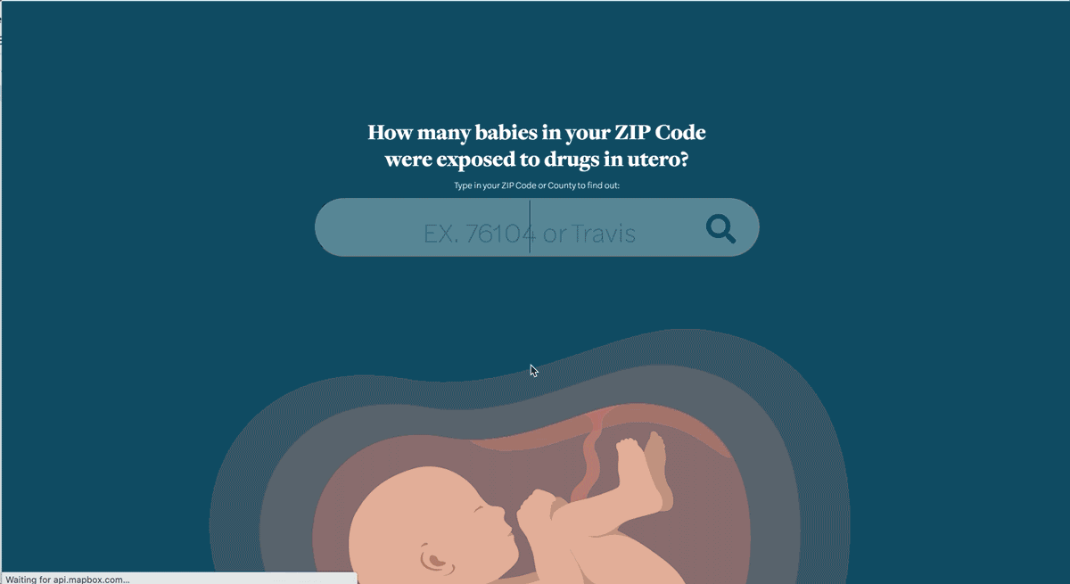
Neonatal Drug Exposure in Texas
Client: Texas Safe Babies, UT System
Date: 2019
Role: Product design & development
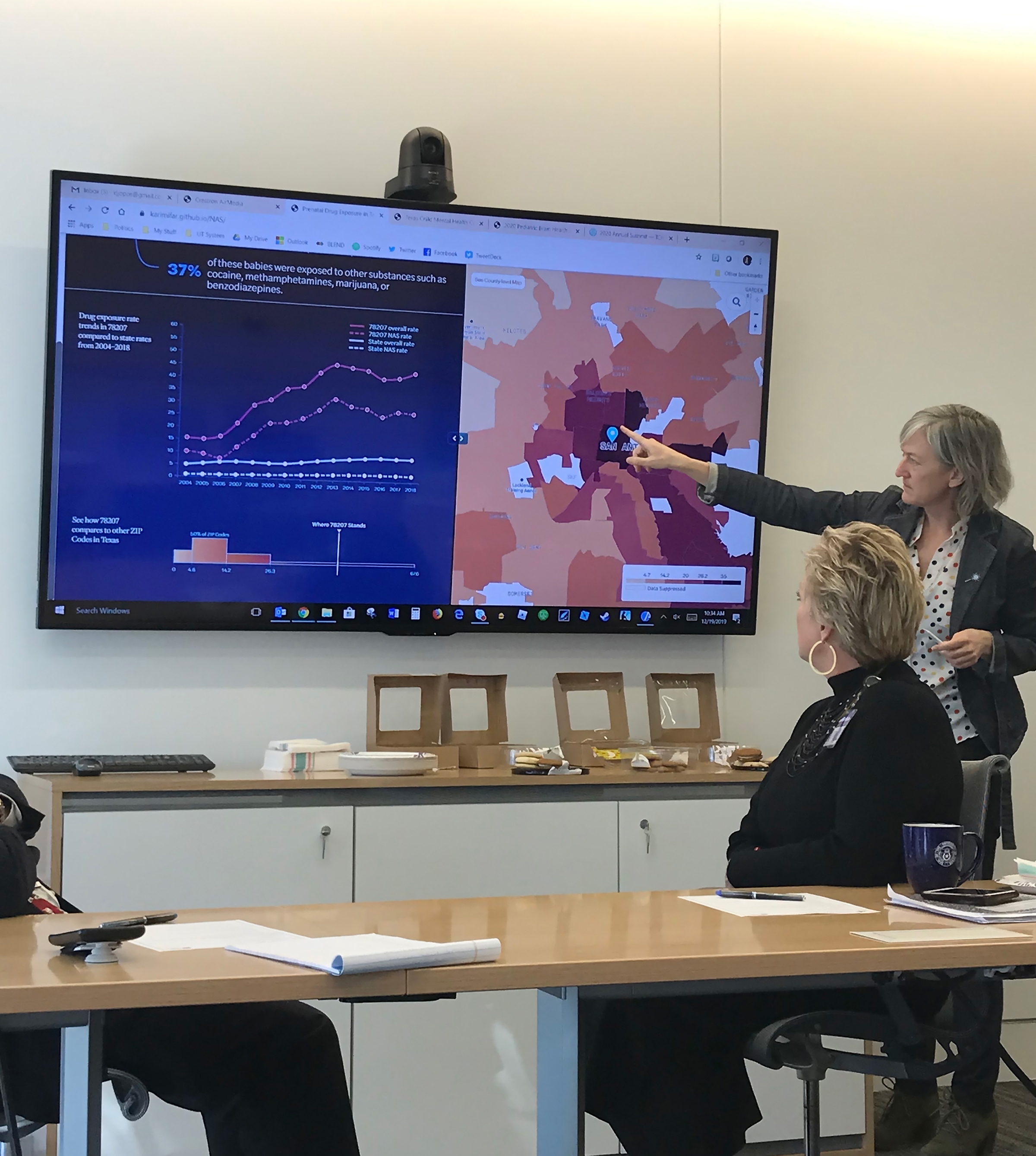
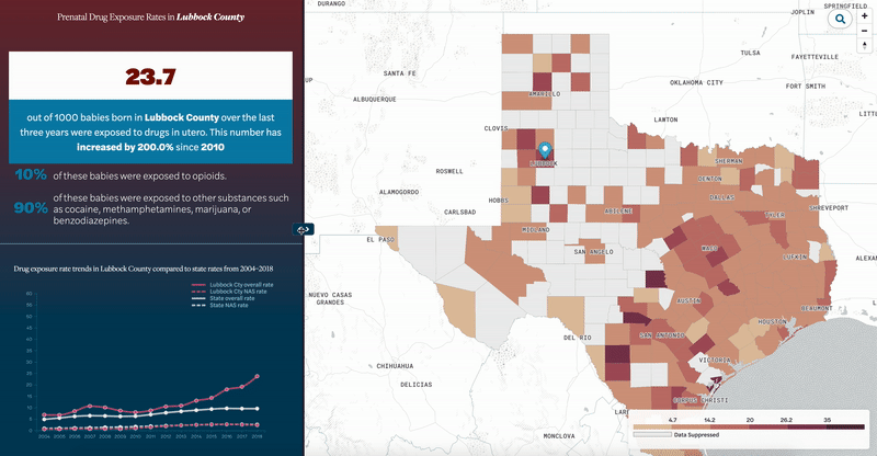
This visualization was created to show the rates of children exposed to drugs before they are born. The goal was to create a simple dashboard to display the data for any given ZIP code or county in an accessible form. The dashboard consists of a 15-year trend line chart and a distribution chart to show where a ZIP code stands compared to others.
A screen recording demonstrating the interactions and transition animations on the landing page
In this project, I experimented to create UI interactions that make the user experience more pleasant and natural than average data visualization dashboards. Some of that effort can be seen in transitional animations or the slider feature to resize the map and dashboard space. I also worked with a visual designer to create and animate an illustration for the landing page.
I implemented a slider feature within the dashboard view, enabling users to dynamically adjust the size of the map and data dashboard according to their current priorities.
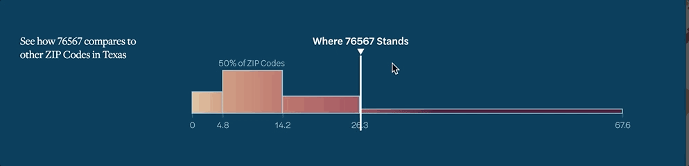
I designed a custom interactive distribution chart to effectively highlight data disparities among the various zip codes.
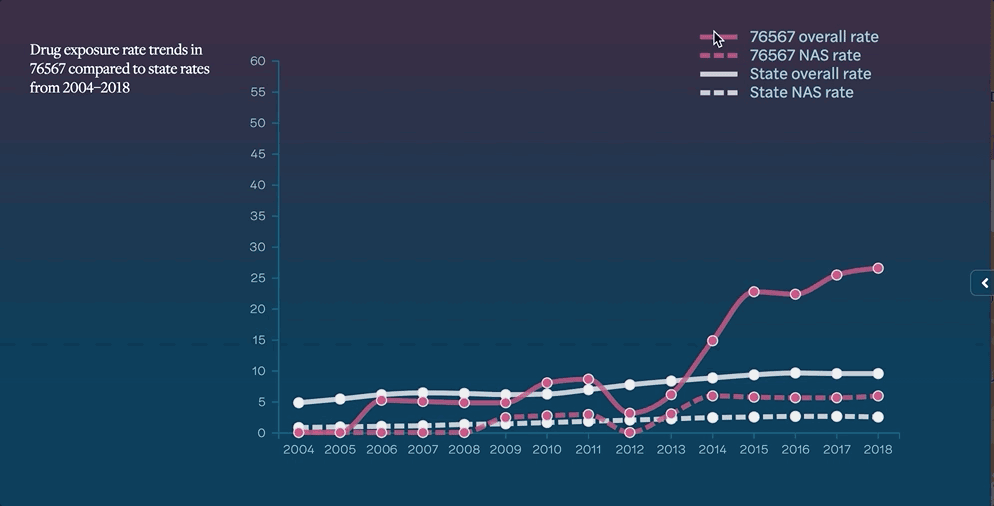
Custom interactions added to the line chart and the legend for a seamless user experience.
Northeast Texas health status report
Client: UT Health Science Center at Tyler, UT System
Date: 2021
Role: Product design & development
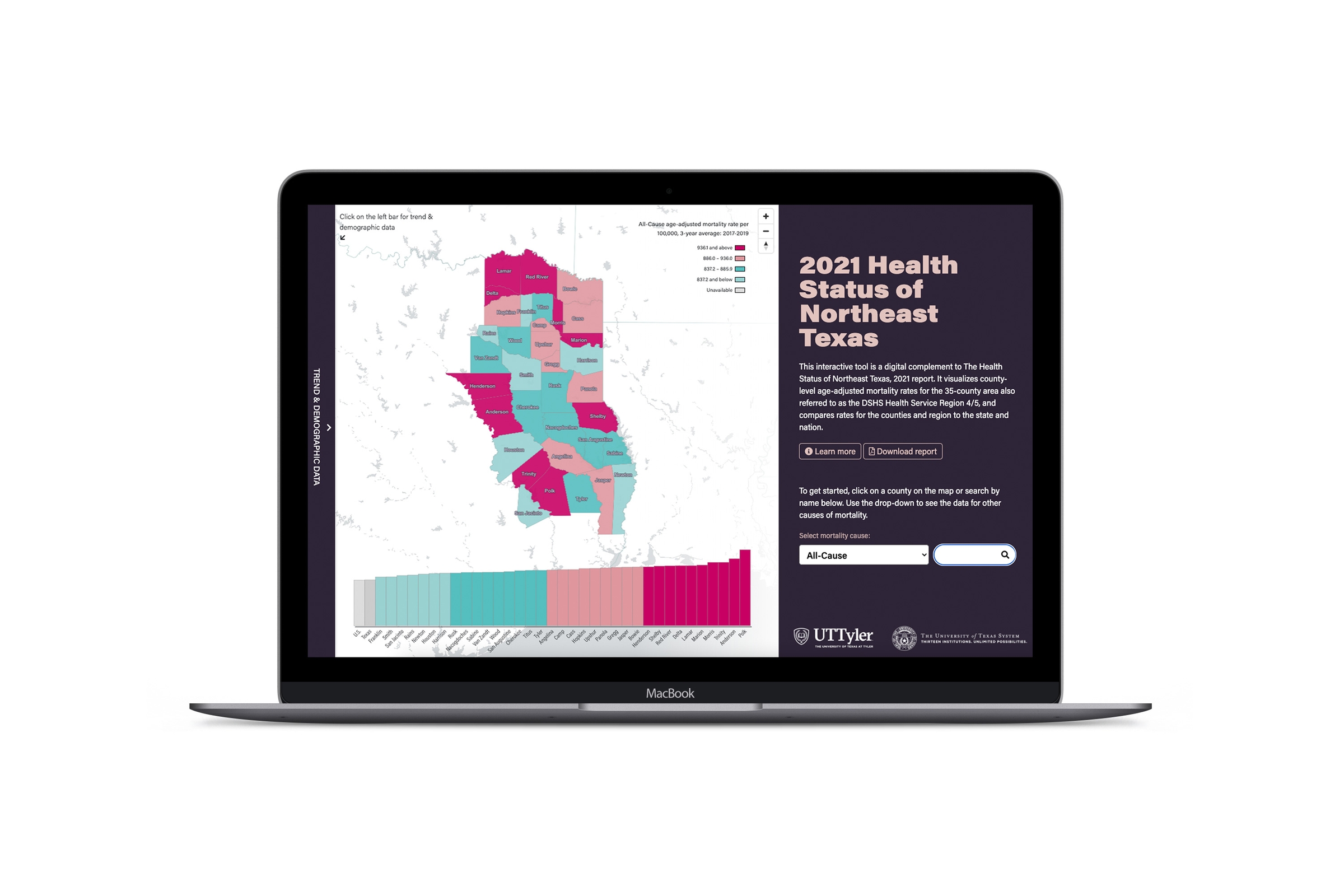
In a collaboration with University of Texas Health Science Center at Tyler, we created a report & an interactive data visualization that studied the status of healthcare in the northeast region of Texas. The interactive piece of the project visualizes top five causes of mortality rates in the region as well as the overall rates. 35 counties in the region are compared to each other, to the overall state, and to the US rates.
Northeast Texas experiences higher mortality rates compared to Texas overall and to the U.S. To illustrate this important disparity, we have created an interactive radar chart that compares the rates of a given county in the Northeast Texas region to the state’s overall rates. Users can also see trend and demographic rates in a collapsible bar for the selected cause of mortality.
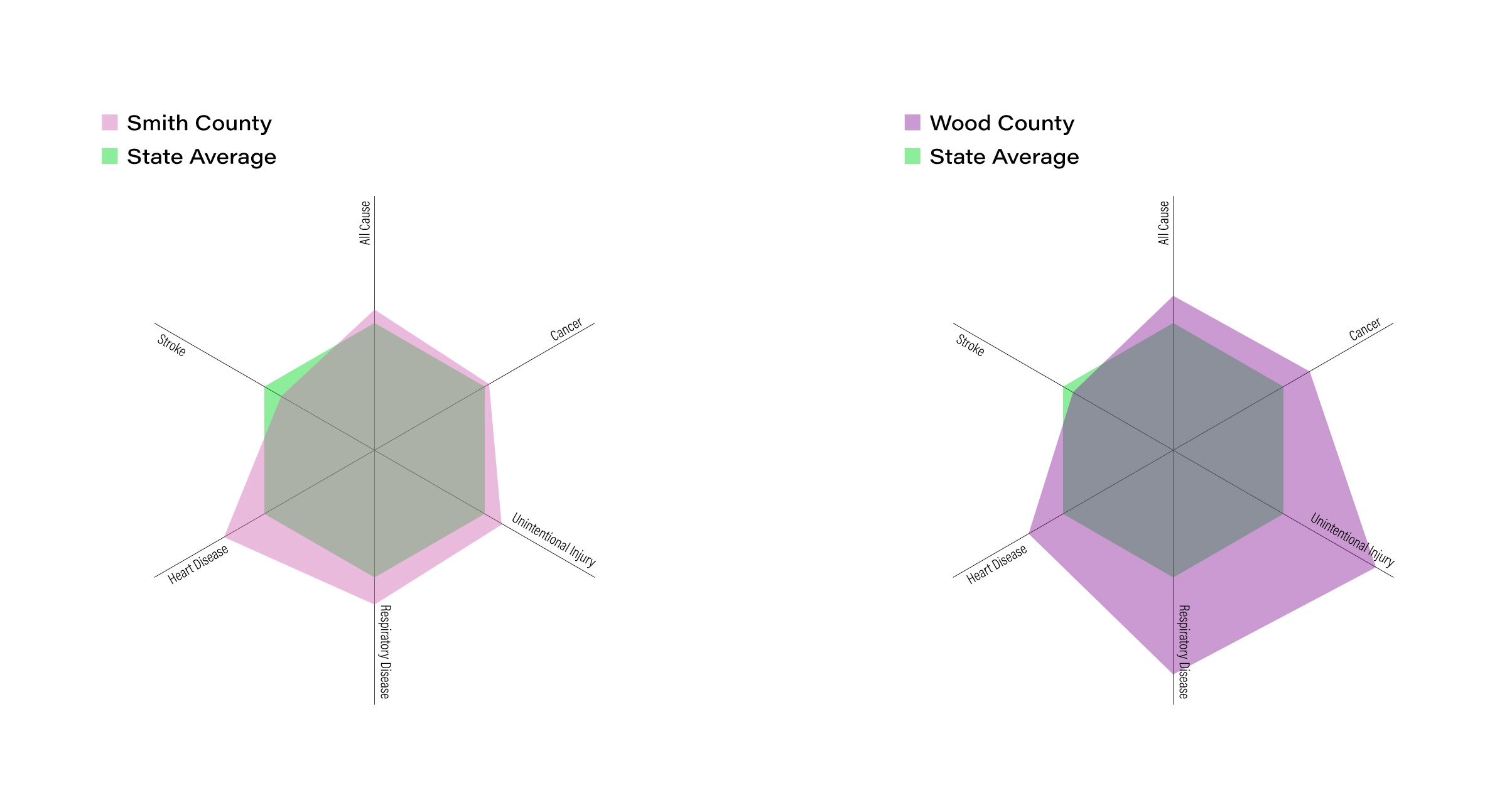
Custom radar chart developed in d3.js to visualize all mortality causes in one view while compating them to the state average.
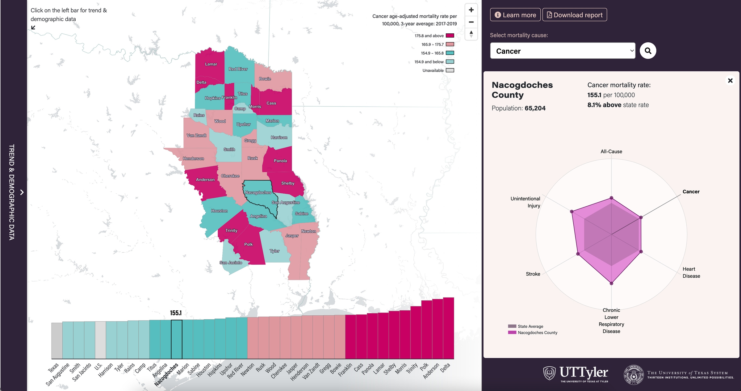
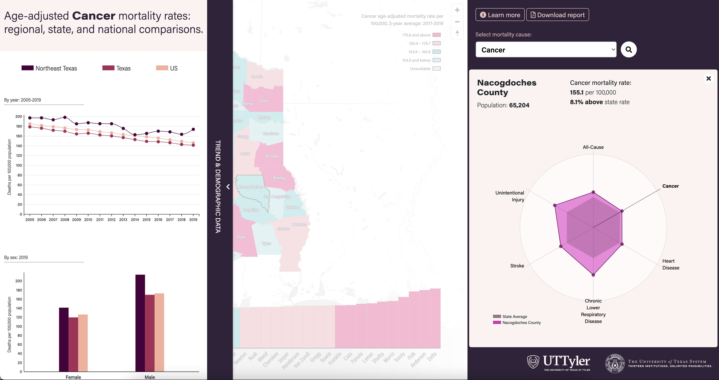
Left: a screenshot of the main data dashboard showcasing the radar chart. Right: a view of side panel when it is open
Life Expectancy in Texas
Client: UT Southwestern Medical Center
Date: 2018–2019
Role: Product design & development
This interactive map reveals the populations and places in Texas where people can expect to live longer–or shorter–lives. Users can see data by gender and race/ethnicity breakdown. This visualization was awarded the best interactive data visualization in health by the American Association of Geographers (AAG) Health & Medical Group in 2019 and has been featured in multiple local & national media outlets such as CBS News, ABC, Washington post, and etc.
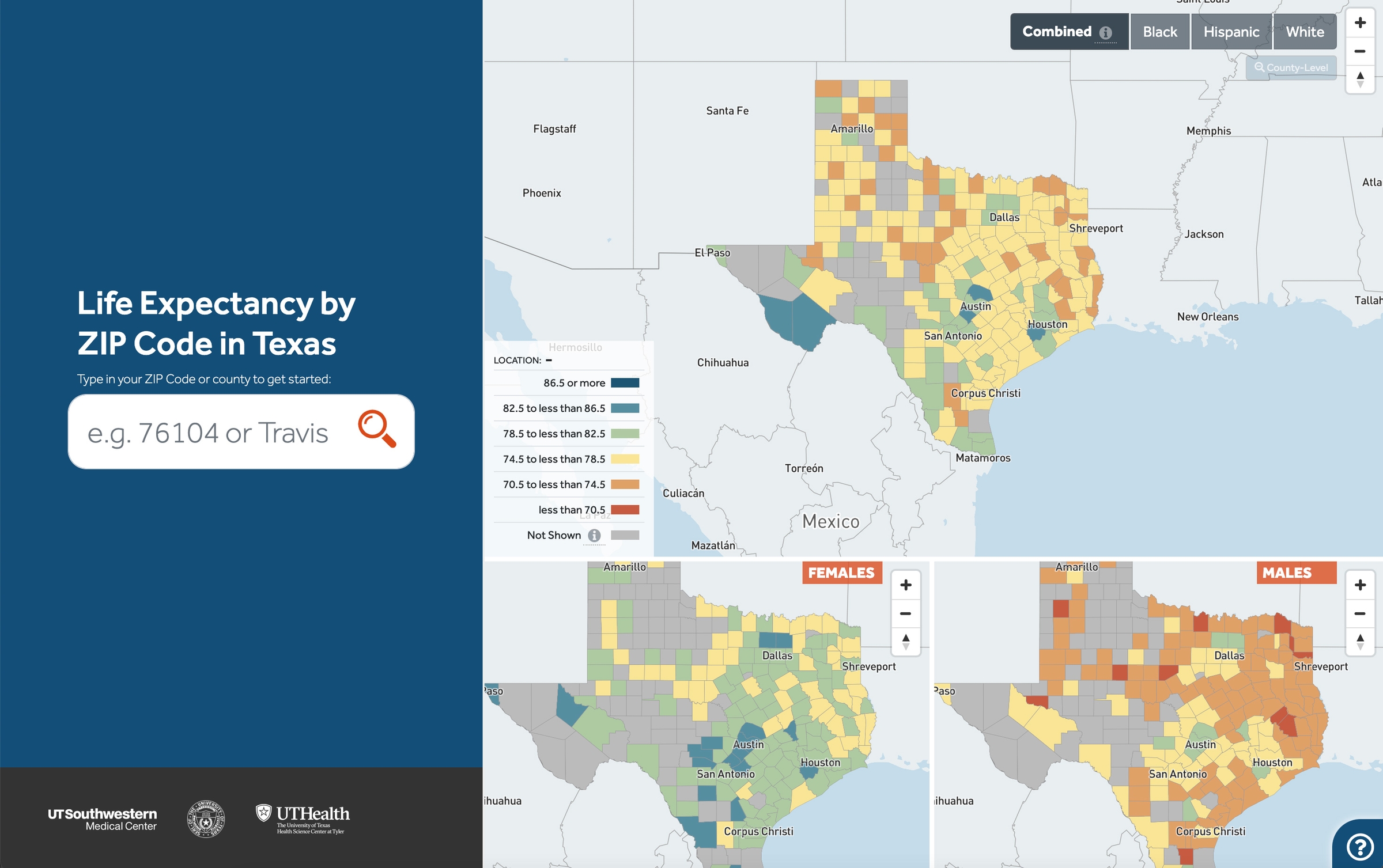
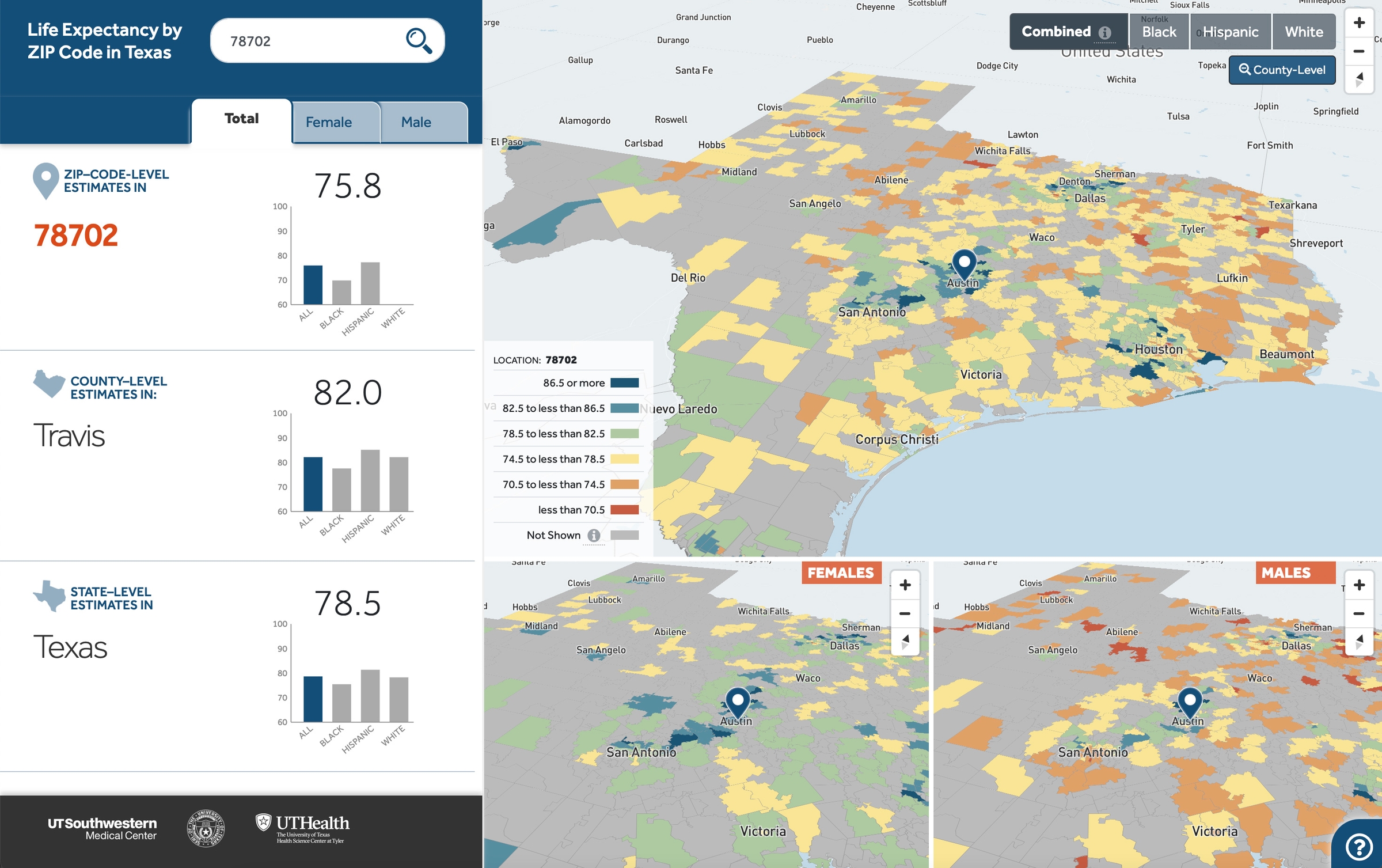
Left: the landing page UI, right: the data dashboard UI after a ZIP Code or county has been queried.
Texas Health Data API
Client: UT System
Date: 2018–Present
Role: Full stack developer
To serve the data visualization tools, I developed a NodeJS RESTful API. The API is currently housed under ‘texashealthdata.com’’ and is available to the public for use in their data analysis software, website or mobile application.
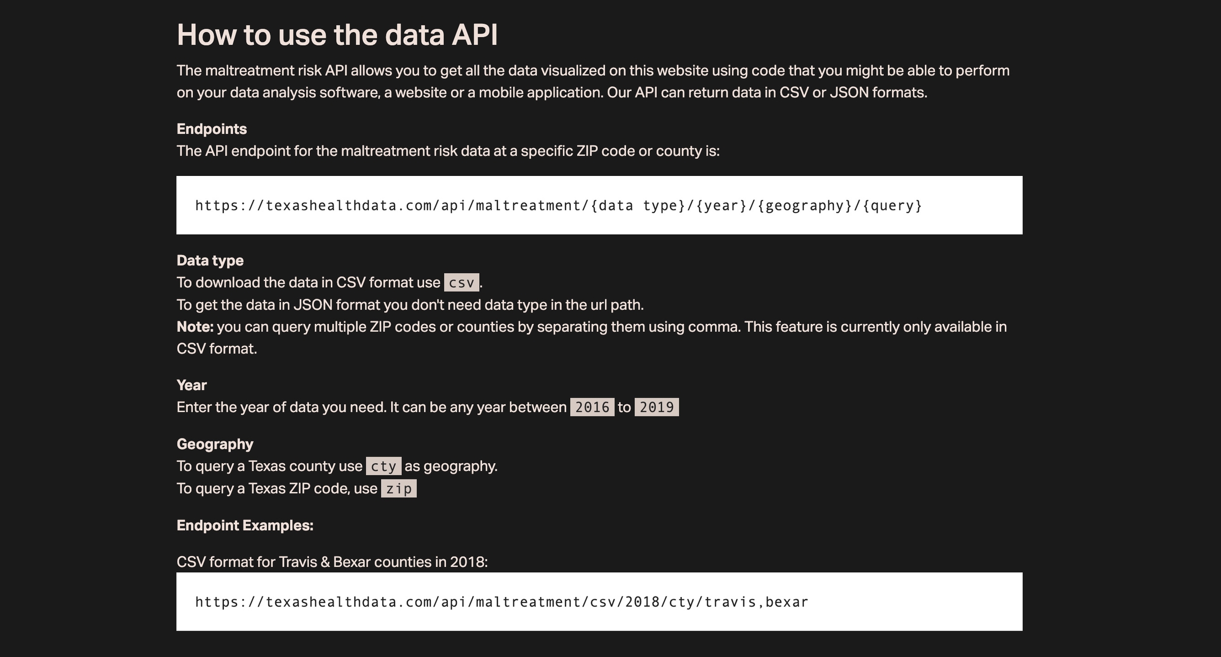
A screenshot from Maltreatment Risk data api documentation page.