2015
50 iterations of Michael Bierut's poster
Custom type design, Visual design


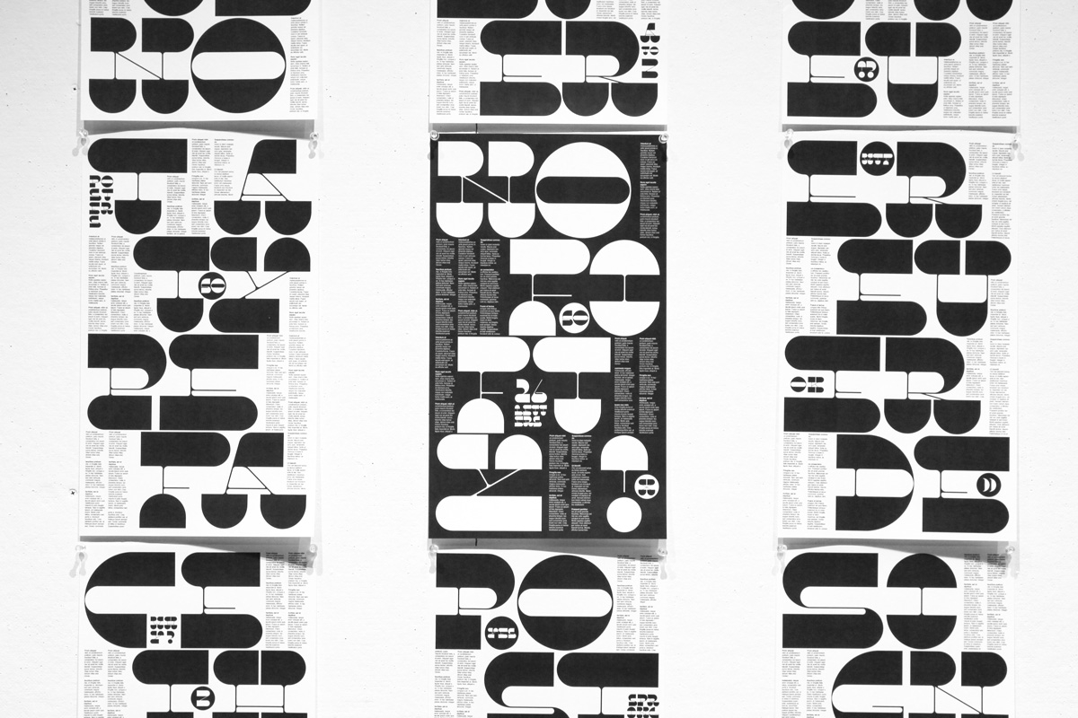
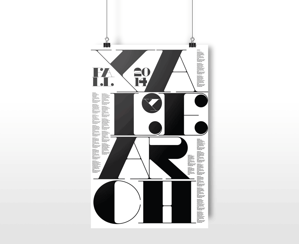
During my advanced typography class at Boston University we were challenged to choose a famous graphic design work and create one new iteration of that piece everyday for 50 days! I picked Michael Bierut's 2014 Yale Arch poster and eventually designed a custom typeface instead of 50 posters!
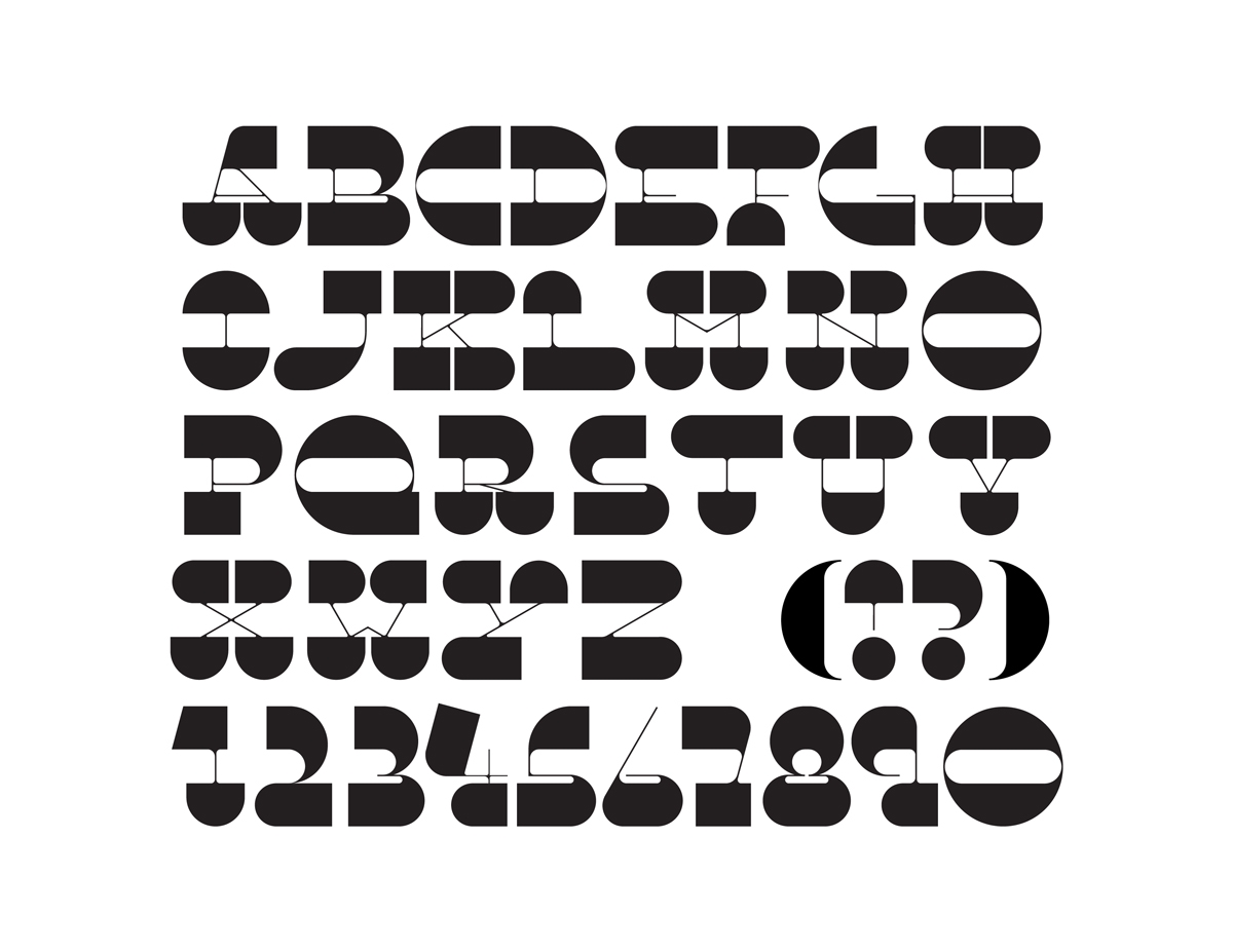
I started by manipulating the elements of the original poster and designing new compositions but throughout the process I decided to construct a new custom typeface that I used in a series of posters telling the story of my journey in the project.
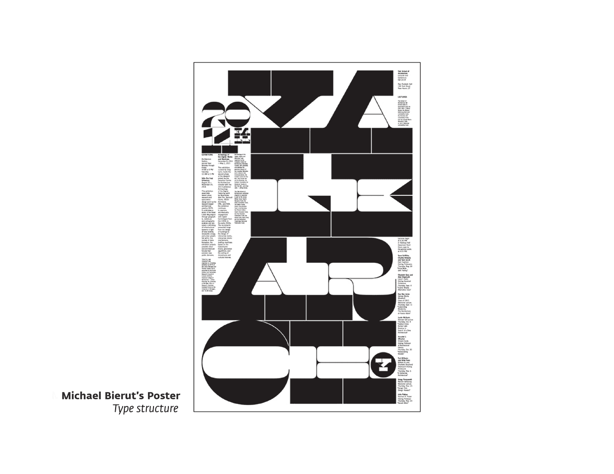
Analyzing the type structure of "2014 Yale Arch" poster designed by Michael Bierut
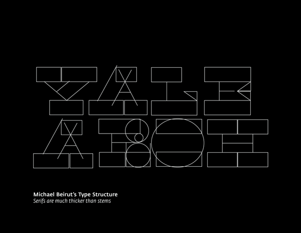
First experiment: reversing the contrast flow of original type by Michael Bierut
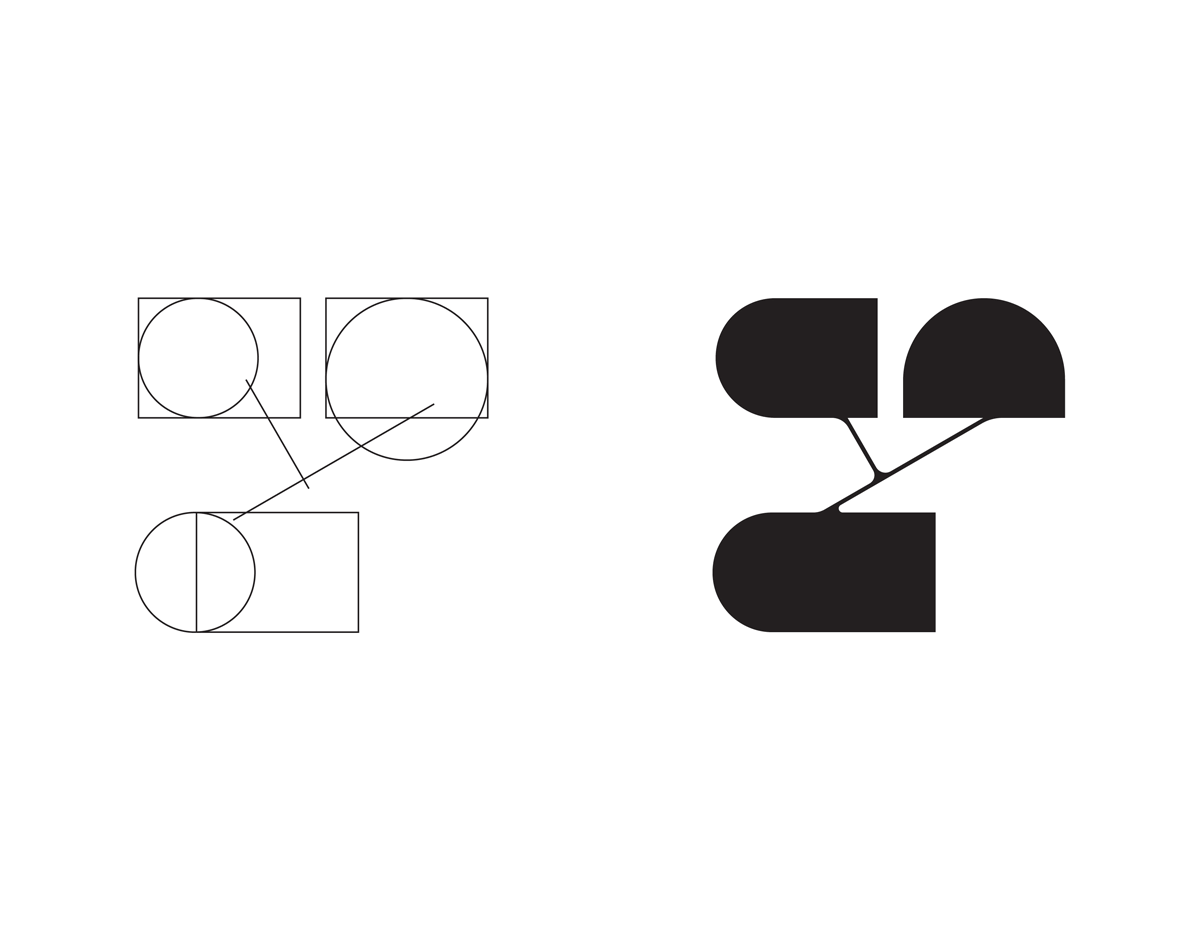
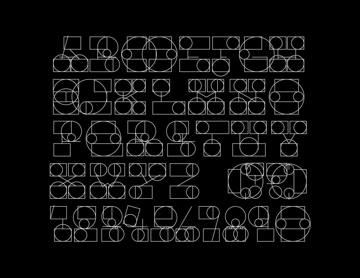
Custom typeface designed following the contrast flow in Michael Bierut's poster